Code
data <- read.csv("/Volumes/anyan-1/frederickanyan.github.io/quantpost_data/dataupset.csv")#


#head(data) #first few rowsFrederick Anyan
June 24, 2023
August 30, 2024
Variables or columns are known as sets in upset visualization. Upset plots can be used to visualize the size and the pairwise combinations or intersections of sets and their aggregates. This facilitates easy-to-understand communication of the size and proportion of set memberships.
Data with multiple variables or their combinations is often displayed in a Venn diagram. In some cases the Euler diagram is used. Both have limitations with increasing number of variables or sets. Upset plots can be used to visualize the size of different variables or sets, frequencies of their overlaps or intersections and their aggregates - for communicating set memberships.
In this tutorial post, we will see how to use the upset() function in the UpSetR package to visualize intersecting sets.
Load data
data <- read.csv("/Volumes/anyan-1/frederickanyan.github.io/quantpost_data/dataupset.csv")#
#head(data) #first few rowsFollowing are symptoms in the data
Let’s change the variable names to the symptom names
For this tutorial, median split was used to categorize participants into two groups namely ‘clinical’ and ‘non-clinical’ - with binary coding as 1 and 0. You can use established cut-off scores for your own data, not the median split.
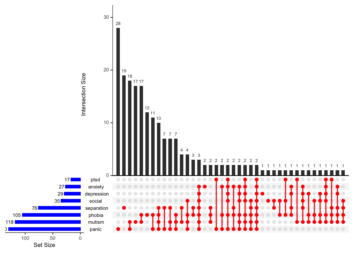
Now visualize the data using the upset() function.
upset(data,                      #Name of data file
      nsets = 8,                #To see all 8 sets in the upset plot
      matrix.color = "red",
      sets.bar.color = "blue",
      order.by = "freq",         #You can order sets by frequencies
set_size.show = TRUE) 
The blue bar chart shows the total size of the sets (i.e., set size).
The red filled-in circles corresponds to intersections or overlaps showing which set is part of an intersection or which disorder overlaps with which other disorder(s). For example, panic and mutism form an intersection or overlap, and so does panic and phobia. Additionally, panic, mutism, phobia and separation also form an intersection. And so on…
The black bar chart shows the occurrence or frequencies for each intersection (i.e., intersection size).